Insert Sparklines
Using Sparklines
Sparkline is a small chart that fits into a cell to represent trends or variations of data. Sparklines have limited functionality compared with regular charts but are an excellent tool to quickly analyze your data and to create a concise visual representation. Sparkline size depends on the size of the cell, change cell width and length to adjust the size. After adding a sparkline, you can still type text or add conditional formatting into the cell. ONLYOFFICE Spreadsheet Editor offers three types of sparklines:
- Column is similar to a regular Column Chart.
- Line is similar to a regular Line Chart.
- Win/Loss is suitable for representing data that include both positive and negative values.
Insert Sparklines
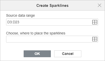
To insert a Sparkline chart, select the data range to include in the sparkline, or click a blank cell where to place it, go to the Insert tab and click the Sparkline button on the top toolbar. Choose a sparkline that serves your purpose. The Create Sparklines window will open, click the Select data icon to specify the data range, and the location of the sparkline, click OK to confirm

Edit and Format Sparklines
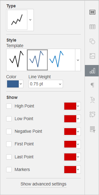
After inserting a sparkline, you can customize and edit it. Click the cell with a sparkline to enable the Sparkline settings tab on the right sidebar.

- In the Type section, you can select one of the available sparkline types drop-down list:
Column - this type is similar to a regular Column Chart.
Line - this type is similar to a regular Line Chart.
Win/Loss - this type is suitable for representing data that include both positive and negative values.
- In the Style section, you can select the style which suits you best from the Template drop-down list, the necessary Color for the sparkline, and the necessary Line Weight (available for the Line sparkline only)
- In the Show section, you can highlight or mark certain data in the sparkline:
High Point – use it to highlight the maximum value.
Low Point – use it to highlight the minimum value.
Negative Point – use it to highlight negative values.
First Point – use it to highlight the starting point in the data range.
Last Point - use it to highlight the end point in the data range.
Markers – is available for Line sparklines only, use it to enable a marker for all points.
Click the down arrow in the color box to select a color for each point.
If you need to make your sparkline more accurate and easier to read, click the Show advanced settings option to open the Sparkline – Advanced Settings window.

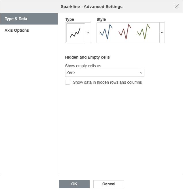
The Type & Data tab allows you to change the sparkline Type and Style as well as specify the Hidden and Empty cells display settings:
-
Show empty cells as - this option allows you to control how sparklines are displayed if some cells in a data range are empty. Select the necessary option from the list:
- Gaps - to display the sparkline with gaps in place of missing data,
- Zero - to display the sparkline as if the value in an empty cell was zero,
- Connect data points with line (available for the Line type only) - to ignore empty cells and display a connecting line between data points.
- Show data in hidden rows and columns - check this box if you want to include values from the hidden cells into sparklines.

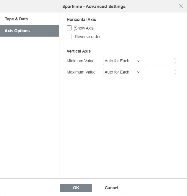
The Axis Options tab allows you to specify the following Horizontal/Vertical Axis parameters:
-
In the Horizontal Axis section, the following parameters are available:
- Show axis - check this box to display the horizontal axis. If the source data contain negative values, this option helps to display them more vividly.
- Reverse order - check this box to display data in the reverse sequence.
-
In the Vertical Axis section, the following parameters are available to define the Minimum/Maximum Value:
-
Minimum/Maximum Value
- Auto for Each - this option is selected by default. It allows you to use own minimum/maximum values for each sparkline. The minimum/maximum values are taken from the separate data series that are used to plot each sparkline. The maximum value for each sparkline will be located at the top of the cell, and the minimum value will be at the bottom.
- Same for All - this option allows you to use the same minimum/maximum value for the entire sparkline group. The minimum/maximum values are taken from the whole data range that is used to plot the sparkline group. The maximum/minimum values for each sparkline will be scaled relative to the highest/lowest value within the range. If you select this option, it will be easier to compare several sparklines.
- Fixed - this option allows you to set a custom minimum/maximum value. The values which are lower or higher than the specified ones are not displayed in the sparklines.
Clear Sparklines
To delete sparklines, select the cell(s) with the sparkline(s) to be removed and right-click on it. Choose Sparklines from the drop-down menu and click Clear Selected Sparklines or Clear the Selected Sparkline Groups.
Return to previous page