Change color scheme
-
element background
-
change color
-
Select background color for a paragraph
-
Set font type, size, and color
-
Insert tables
-
Set font type, size, and color
-
Select cell background color
-
Add cell borders
-
Insert autoshapes
-
Set font type, size, and color
-
Insert tables
-
Select background color for a paragraph
-
Set font type, size, and color
-
Insert tables
-
Set font type, size, and color
-
Select cell background color
-
Add cell borders
-
Insert autoshapes
-
Set font type, size, and color
-
Insert tables
-
Select background color for a paragraph
-
Insert tables
-
Set font type, size, and color
-
Select cell background color
-
Add cell borders
-
Insert autoshapes
-
Set font type, size, and color
-
Insert tables
-
Select background color for a paragraph
-
Set font type, size, and color
-
Insert tables
-
Set font type, size, and color
-
Select cell background color
-
Add cell borders
-
Insert autoshapes
-
Set font type, size, and color
-
Insert tables
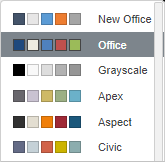
Color schemes are applied to the whole document. In the Document Editor, you can quickly change the appearance of your document because they define the Theme Colors palette for different document elements (font, background, tables, autoshapes, charts). If you applied some Theme Colors to the document elements and then select a different Color Scheme, the applied colors in your document will change correspondingly.
To change a color scheme, click the downward arrow next to the Color Scheme icon on the Layout tab of the top toolbar and select the required color scheme from the list: Aspect, Blue Green, Blue II, Blue Warm, Blue, Grayscale, Green Yellow, Green, Marquee, Median, Office 2007-2010, Office 2013-2022, Office, Orange Red, Orange, Paper, Red Orange, Red Violet, Red, Slipstream, Violet II, Violet, Yellow Orange, Yellow, and New Office. The selected color scheme will be highlighted in the list.
Once you select the preferred color scheme, you can select other colors in the color palettes window that corresponds to the document element you want to apply the color to. For most document elements, the color palettes window can be accessed by clicking the colored box on the right sidebar when the required element is selected. For the font, this window can be opened using the downward arrow next to the Font color icon on the Home tab of the top toolbar. The following palettes are available:
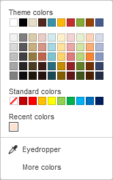
- Theme colors - the colors that correspond to the selected color scheme of the document.
- Standard colors - a set of default colors. The selected color scheme does not affect them.
-
You can also apply a custom color using two different options:
Return to previous page