Adjust chart appearance
Currently, you can adjust the appearance of an existing chart in the presentation. To do that:
- select the chart by tapping it,
- open the chart settings panel by
- tapping the
 icon at the top toolbar, or
- tapping the More option in the pop-up menu and choosing the Edit menu item,
- tap the necessary menu item: Style, Reorder, or Align. Use the
 Back arrow on the left to return to the previous settings section.
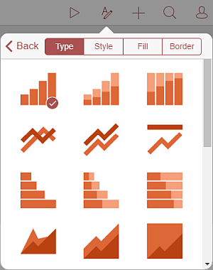
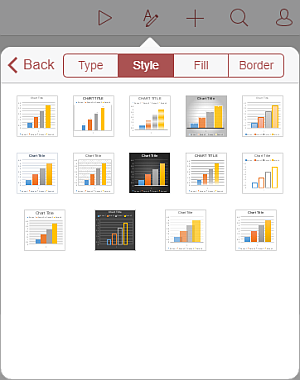
The Style section contains the following four tabs:
- Type - to change the current chart type (line chart, column chart, bar chart, area chart, pie chart, point chart, or stock chart). Swipe up to see all the chart types and tap the one you want to apply.

- Style - to change the current chart style. Swipe up to see all the available styles and tap the one you want to apply.

- Fill - to change the chart background fill by selecting a solid color. Swipe up to see all the palettes and tap the necessary color on the Theme Colors or Standard Colors palette. If you don't want to use any fill, tap the
 icon on the Standard Colors palette.
- Border - to adjust the chart border Size by dragging the slider and select the border Color on the palette.
The Reorder section allows to set the selected chart position as related to other objects when several objects overlap each other. To learn more, please refer to the Manipulate objects section of this guide.
The Align section allows to align the chart on the slide. To learn more, please refer to the Manipulate objects section of this guide.
Remove the chart
Select the chart by tapping on it and proceed in one of the following ways:
- tap the More option in the pop-up menu and choose the Delete menu item, or
- open the settings panel by tapping the
 icon at the top toolbar, switch to the Chart tab, swipe up and tap the Remove Chart button.