Creating and managing form fields in the PDF Editor
The PDF Editor allows you to create fillable forms by adding form fields to your PDF files. All the form tools are available on the Forms tab of the top toolbar:
- Form fields: Text Field, Combo Box, List Box, Checkbox, Radio Button, Image, Signature, Email Address, Phone Number, Date & Time, ZIP Code, Credit Card.
- Insert fields for - choose the recipient role for the fields you are about to insert.
- Manage Recipient Roles - create and edit recipient roles. To learn more, please read the Managing recipient roles guide.
- Preview - see how the form will look to the users filling it out.

Creating a text field
Text fields are form fields where users can enter text.
To insert a text field:
- Switch to the Forms tab of the top toolbar.
- Click the
 Text Field button.
The field will be added at the cursor position, and the Form settings menu will open on the right sidebar.
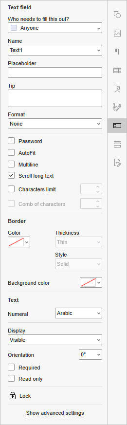
- Who needs to fill this out? - choose the recipient role to set the group of users who can fill in this field.
- Name - enter the field name manually, or choose one from the list if you have already created names for other fields. Fields with the same name share the same value.
- Placeholder - enter the text displayed in the empty field.
- Tip - enter the text displayed when a user hovers the mouse pointer over the field.
- Format - choose the content format of the field from the list: None, Number, Percentage, Date, Time, Special, or Custom. To learn more about the format options, please read the Format section below.
- Password - check this box to hide the entered characters.
- AutoFit - check this box to automatically fit the font size to the field size.
- Multiline - check this box to allow entering text in multiple lines. Otherwise, the text occupies a single line.
- Scroll long text - check this box to allow scrolling the text that exceeds the field size.
- Characters limit - check this box and enter the maximum number of characters allowed in the field.
- Comb of characters - check this box to spread the characters evenly across the field. To use this option, set the Characters limit first.
- Border - set the border Color, Thickness and Style, as well as the Background Color of the field.
- Text - choose the numerals used in the field: Arabic or Hindi.
- Display - choose how the field is displayed: Visible, Hidden, Visible but doesn't print, or Hidden but printable.
- Orientation - enter the rotation angle of the field in degrees.
- Required - check this box to make the field mandatory to fill in.
- Read only - check this box to prevent users from changing the field value.
To open more settings, click the Show advanced settings link in the Form settings menu. To learn more, please read the Advanced settings section below.
Creating a combo box
Combo boxes contain a drop-down list with a set of choices.
To insert a combo box:
- Switch to the Forms tab of the top toolbar.
- Click the
 Combo Box button.
The field will be added at the cursor position, and the Form settings menu will open on the right sidebar.
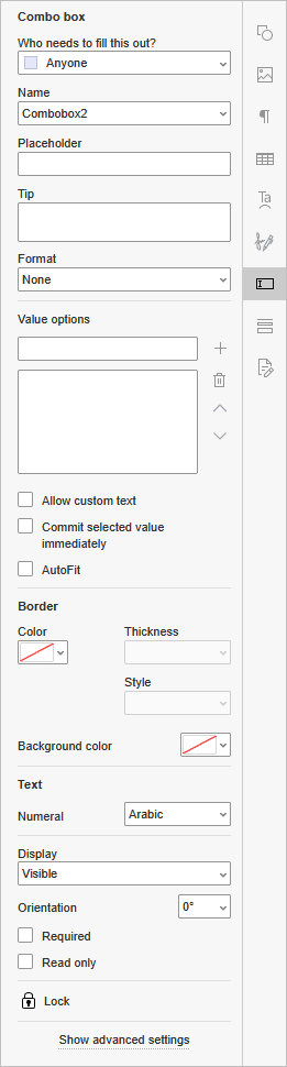
- Who needs to fill this out? - choose the recipient role to set the group of users who can fill in this field.
- Name - enter the field name manually, or choose one from the list if you have already created names for other fields. Fields with the same name share the same value.
- Placeholder - enter the text displayed in the empty field.
- Tip - enter the text displayed when a user hovers the mouse pointer over the field.
- Format - choose the content format of the field from the list: None, Number, Percentage, Date, Time, Special, or Custom. To learn more about the format options, please read the Format section below.
- Value options - add
 new values, delete
  them, or move them up
  and down
  in the list.
 - Allow custom text - check this box to let users enter their own value in addition to choosing one from the list.
- Commit selected value immediately - check this box to save the value as soon as a user selects it.
- AutoFit - check this box to automatically fit the font size to the field size.
- Border - set the border Color, Thickness and Style, as well as the Background Color of the field.
- Text - choose the numerals used in the field: Arabic or Hindi.
- Display - choose how the field is displayed: Visible, Hidden, Visible but doesn't print, or Hidden but printable.
- Orientation - enter the rotation angle of the field in degrees.
- Required - check this box to make the field mandatory to fill in.
- Read only - check this box to prevent users from changing the field value.
To open more settings, click the Show advanced settings link in the Form settings menu. To learn more, please read the Advanced settings section below.
Creating a list box
List boxes display a list of choices that users can select from.
To insert a list box:
- Switch to the Forms tab of the top toolbar.
- Click the
 List Box button.
The field will be added at the cursor position, and the Form settings menu will open on the right sidebar.
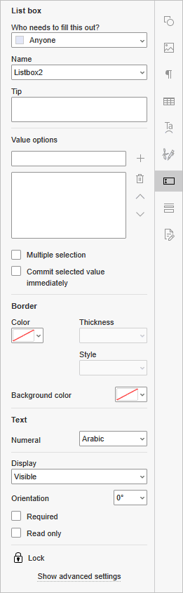
- Who needs to fill this out? - choose the recipient role to set the group of users who can fill in this field.
- Name - enter the field name manually, or choose one from the list if you have already created names for other fields. Fields with the same name share the same value.
- Tip - enter the text displayed when a user hovers the mouse pointer over the field.
- Value options - add new values, delete them, or move them up and down in the list.
- Multiple selection - check this box to let users select more than one value from the list.
- Commit selected value immediately - check this box to save the value as soon as a user selects it.
- Border - set the border Color, Thickness and Style, as well as the Background Color of the field.
- Text - choose the numerals used in the field: Arabic or Hindi.
- Display - choose how the field is displayed: Visible, Hidden, Visible but doesn't print, or Hidden but printable.
- Orientation - enter the rotation angle of the field in degrees.
- Required - check this box to make the field mandatory to fill in.
- Read only - check this box to prevent users from changing the field value.
To set up actions for the field, click the Show advanced settings link in the Form settings menu. Only the Actions tab is available for list boxes. To learn more, please read the description of the Actions tab below.
Creating a checkbox
Checkboxes provide users with options, any number of which can be selected. Each checkbox can be checked or unchecked independently.
To insert a checkbox:
- Switch to the Forms tab of the top toolbar.
- Click the
 Checkbox button.
The field will be added at the cursor position, and the Form settings menu will open on the right sidebar.
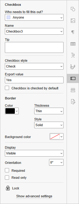
- Who needs to fill this out? - choose the recipient role to set the group of users who can fill in this field.
- Name - enter the field name manually, or choose one from the list if you have already created names for other fields. Fields with the same name share the same value.
- Tip - enter the text displayed when a user hovers the mouse pointer over the field.
- Checkbox style - choose how the checked box looks: Check, Cross, Square, Diamond, Circle, or Star.
- Export value - enter the value assigned to the checkbox when it is checked. Yes is set by default.
- Checkbox is checked by default - check this box so that the checkbox is checked when the form is opened.
- Border - set the border Color, Thickness and Style, as well as the Background Color of the field.
- Display - choose how the field is displayed: Visible, Hidden, Visible but doesn't print, or Hidden but printable.
- Orientation - enter the rotation angle of the field in degrees.
- Required - check this box to make the field mandatory to fill in.
- Read only - check this box to prevent users from changing the field value.
To set up actions for the field, click the Show advanced settings link in the Form settings menu. Only the Actions tab is available for checkboxes. To learn more, please read the description of the Actions tab below.
Creating a radio button
Radio buttons provide users with a set of options, only one of which can be selected. Radio buttons with the same Name form a group, so to create a set of options, give all the buttons in the set the same name and a different Radio button choice.
To insert a radio button:
- Switch to the Forms tab of the top toolbar.
- Click the
 Radio Button button.
The field will be added at the cursor position, and the Form settings menu will open on the right sidebar.
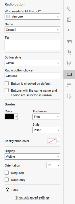
- Who needs to fill this out? - choose the recipient role to set the group of users who can fill in this field.
- Name - enter the field name manually, or choose one from the list if you have already created names for other fields. Fields with the same name share the same value.
- Tip - enter the text displayed when a user hovers the mouse pointer over the field.
- Button style - choose how the selected button looks: Check, Cross, Square, Diamond, Circle, or Star.
- Radio button choice - enter the value of this option. Choice1 is set by default.
- Button is checked by default - check this box so that the button is selected when the form is opened.
- Buttons with the same name and choice are selected in unison - check this box so that selecting one button also selects all other buttons with the same name and choice.
- Border - set the border Color, Thickness and Style, as well as the Background Color of the field.
- Display - choose how the field is displayed: Visible, Hidden, Visible but doesn't print, or Hidden but printable.
- Orientation - enter the rotation angle of the field in degrees.
- Required - check this box to make the field mandatory to fill in.
- Read only - check this box to prevent users from changing the field value.
To set up actions for the field, click the Show advanced settings link in the Form settings menu. Only the Actions tab is available for radio buttons. To learn more, please read the description of the Actions tab below.
Creating an image field
Image fields are used to add images to the form.
To insert an image field:
- Switch to the Forms tab of the top toolbar.
- Click the
 Image button.
The field will be added at the cursor position, and the Form settings menu will open on the right sidebar.
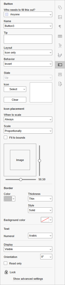
- Who needs to fill this out? - choose the recipient role to set the group of users who can fill in this field.
- Name - enter the field name manually, or choose one from the list if you have already created names for other fields. Fields with the same name share the same value.
- Tip - enter the text displayed when a user hovers the mouse pointer over the field.
- Layout - choose how the label and the icon are arranged in the field: Label only, Icon only, Icon top, label bottom, Label top, icon bottom, Icon left, label right, Label left, icon right, or Label over icon.
-
Behavior - choose how the field looks when a user clicks it:
- None - the field does not change.
- Push - the field looks pressed.
- Outline - the field border is highlighted.
- Invert - the field colors are inverted.
The behavior effects are visible when filling out the form. To check them, click the Preview button on the Forms tab.
-
State - choose the field state to set up its Label and Icon separately. This list is available only when Behavior is set to Push.
- Up - the field when it is not clicked.
- Down - the field while a user clicks it.
- Rollover - the field while a user hovers the mouse pointer over it.
- Label - enter the text displayed in the field.
- Icon - click the Select button to add an image From file, From URL, or From storage. To remove the image, click the Clear button.
-
Icon placement - set how the image is placed within the field:
- When to scale - choose when the image is scaled to the field size: Always, Never, Image is too big, or Image is too small.
- Scale - choose Proportionally to keep the image aspect ratio, or Non-proportionally to stretch the image to the field.
- Fit to bounds - check this box to fit the image to the field borders.
- Drag the horizontal and vertical sliders to position the image within the field.
- Border - set the border Color, Thickness and Style, as well as the Background Color of the field.
- Text - choose the numerals used in the field: Arabic or Hindi.
- Display - choose how the field is displayed: Visible, Hidden, Visible but doesn't print, or Hidden but printable.
- Orientation - enter the rotation angle of the field in degrees.
- Read only - check this box to prevent users from changing the field value.
To set up actions for the field, click the Show advanced settings link in the Form settings menu. Only the Actions tab is available for image fields. To learn more, please read the description of the Actions tab below.
Creating a signature field
Signature fields are used to add a place for signing the form. To learn how users can sign the form, please read the Adding a signature guide.
To insert a signature field:
- Switch to the Forms tab of the top toolbar.
- Click the
 Signature button.
The field will be added at the cursor position, and the Form settings menu will open on the right sidebar.
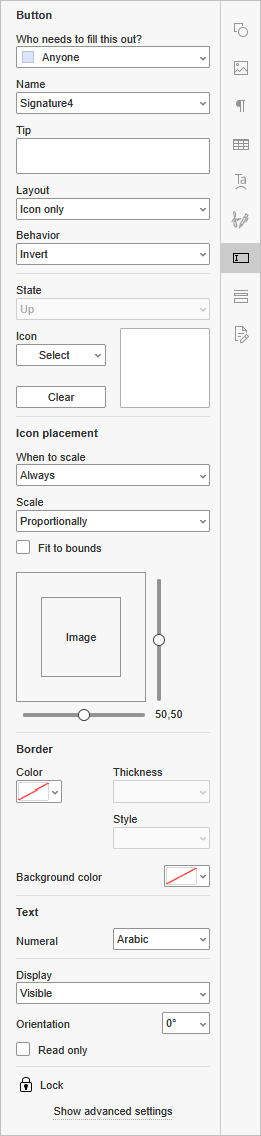
- Who needs to fill this out? - choose the recipient role to set the group of users who can fill in this field.
- Name - enter the field name manually, or choose one from the list if you have already created names for other fields. Fields with the same name share the same value.
- Tip - enter the text displayed when a user hovers the mouse pointer over the field.
- Layout - choose how the label and the icon are arranged in the field: Label only, Icon only, Icon top, label bottom, Label top, icon bottom, Icon left, label right, Label left, icon right, or Label over icon.
-
Behavior - choose how the field looks when a user clicks it:
- None - the field does not change.
- Push - the field looks pressed.
- Outline - the field border is highlighted.
- Invert - the field colors are inverted.
The behavior effects are visible when filling out the form. To check them, click the Preview button on the Forms tab.
-
State - choose the field state to set up its Label and Icon separately. This list is available only when Behavior is set to Push.
- Up - the field when it is not clicked.
- Down - the field while a user clicks it.
- Rollover - the field while a user hovers the mouse pointer over it.
- Label - enter the text displayed in the field.
- Icon - click the Select button to add an image From file, From URL, or From storage. To remove the image, click the Clear button.
-
Icon placement - set how the image is placed within the field:
- When to scale - choose when the image is scaled to the field size: Always, Never, Image is too big, or Image is too small.
- Scale - choose Proportionally to keep the image aspect ratio, or Non-proportionally to stretch the image to the field.
- Fit to bounds - check this box to fit the image to the field borders.
- Drag the horizontal and vertical sliders to position the image within the field.
- Border - set the border Color, Thickness and Style, as well as the Background Color of the field.
- Text - choose the numerals used in the field: Arabic or Hindi.
- Display - choose how the field is displayed: Visible, Hidden, Visible but doesn't print, or Hidden but printable.
- Orientation - enter the rotation angle of the field in degrees.
- Read only - check this box to prevent users from changing the field value.
To set up actions for the field, click the Show advanced settings link in the Form settings menu. Only the Actions tab is available for signature fields. To learn more, please read the description of the Actions tab below.
Creating an email address field
Email address fields are used to enter email addresses. The Format of the field is set to None by default.
To insert an email address field:
- Switch to the Forms tab of the top toolbar.
- Click the
 Email Address button.
The field will be added at the cursor position, and the Form settings menu will open on the right sidebar.
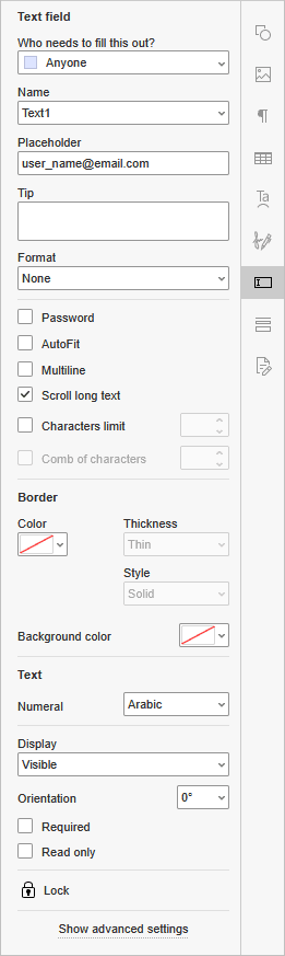
- Who needs to fill this out? - choose the recipient role to set the group of users who can fill in this field.
- Name - enter the field name manually, or choose one from the list if you have already created names for other fields. Fields with the same name share the same value.
- Placeholder - enter the text displayed in the empty field.
- Tip - enter the text displayed when a user hovers the mouse pointer over the field.
- Format - choose the content format of the field from the list: None, Number, Percentage, Date, Time, Special, or Custom. To learn more about the format options, please read the Format section below.
- Password - check this box to hide the entered characters.
- AutoFit - check this box to automatically fit the font size to the field size.
- Multiline - check this box to allow entering text in multiple lines. Otherwise, the text occupies a single line.
- Scroll long text - check this box to allow scrolling the text that exceeds the field size.
- Characters limit - check this box and enter the maximum number of characters allowed in the field.
- Comb of characters - check this box to spread the characters evenly across the field. To use this option, set the Characters limit first.
- Border - set the border Color, Thickness and Style, as well as the Background Color of the field.
- Text - choose the numerals used in the field: Arabic or Hindi.
- Display - choose how the field is displayed: Visible, Hidden, Visible but doesn't print, or Hidden but printable.
- Orientation - enter the rotation angle of the field in degrees.
- Required - check this box to make the field mandatory to fill in.
- Read only - check this box to prevent users from changing the field value.
To open more settings, click the Show advanced settings link in the Form settings menu. To learn more, please read the Advanced settings section below.
Creating a phone number field
Phone number fields are used to enter phone numbers. By default, the Format of the field is set to Special, with the Arbitrary Mask option and the (999)999-9999 mask.
To insert a phone number field:
- Switch to the Forms tab of the top toolbar.
- Click the
 Phone Number button.
The field will be added at the cursor position, and the Form settings menu will open on the right sidebar.
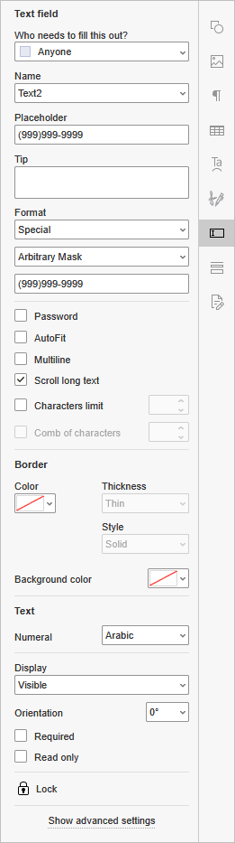
- Who needs to fill this out? - choose the recipient role to set the group of users who can fill in this field.
- Name - enter the field name manually, or choose one from the list if you have already created names for other fields. Fields with the same name share the same value.
- Placeholder - enter the text displayed in the empty field.
- Tip - enter the text displayed when a user hovers the mouse pointer over the field.
- Format - choose the content format of the field from the list: None, Number, Percentage, Date, Time, Special, or Custom. To learn more about the format options, please read the Format section below.
- Password - check this box to hide the entered characters.
- AutoFit - check this box to automatically fit the font size to the field size.
- Multiline - check this box to allow entering text in multiple lines. Otherwise, the text occupies a single line.
- Scroll long text - check this box to allow scrolling the text that exceeds the field size.
- Characters limit - check this box and enter the maximum number of characters allowed in the field.
- Comb of characters - check this box to spread the characters evenly across the field. To use this option, set the Characters limit first.
- Border - set the border Color, Thickness and Style, as well as the Background Color of the field.
- Text - choose the numerals used in the field: Arabic or Hindi.
- Display - choose how the field is displayed: Visible, Hidden, Visible but doesn't print, or Hidden but printable.
- Orientation - enter the rotation angle of the field in degrees.
- Required - check this box to make the field mandatory to fill in.
- Read only - check this box to prevent users from changing the field value.
To open more settings, click the Show advanced settings link in the Form settings menu. To learn more, please read the Advanced settings section below.
Creating a date and time field
Date and time fields are used to enter dates. By default, the Format of the field is set to Date, with the m/d/yy date format.
To insert a date and time field:
- Switch to the Forms tab of the top toolbar.
- Click the
 Date & Time button.
The field will be added at the cursor position, and the Form settings menu will open on the right sidebar.
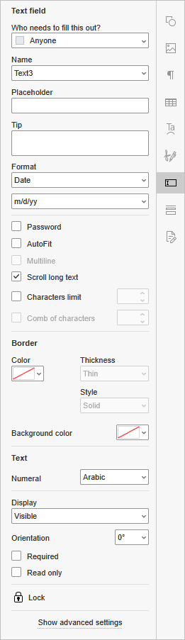
- Who needs to fill this out? - choose the recipient role to set the group of users who can fill in this field.
- Name - enter the field name manually, or choose one from the list if you have already created names for other fields. Fields with the same name share the same value.
- Placeholder - enter the text displayed in the empty field.
- Tip - enter the text displayed when a user hovers the mouse pointer over the field.
- Format - choose the content format of the field from the list: None, Number, Percentage, Date, Time, Special, or Custom. To learn more about the format options, please read the Format section below.
- Password - check this box to hide the entered characters.
- AutoFit - check this box to automatically fit the font size to the field size.
- Multiline - check this box to allow entering text in multiple lines. Otherwise, the text occupies a single line.
- Scroll long text - check this box to allow scrolling the text that exceeds the field size.
- Characters limit - check this box and enter the maximum number of characters allowed in the field.
- Comb of characters - check this box to spread the characters evenly across the field. To use this option, set the Characters limit first.
- Border - set the border Color, Thickness and Style, as well as the Background Color of the field.
- Text - choose the numerals used in the field: Arabic or Hindi.
- Display - choose how the field is displayed: Visible, Hidden, Visible but doesn't print, or Hidden but printable.
- Orientation - enter the rotation angle of the field in degrees.
- Required - check this box to make the field mandatory to fill in.
- Read only - check this box to prevent users from changing the field value.
To open more settings, click the Show advanced settings link in the Form settings menu. To learn more, please read the Advanced settings section below.
Creating a ZIP code field
ZIP code fields are used to enter ZIP codes. By default, the Format of the field is set to Special, with the Arbitrary Mask option and the 99999-9999 mask.
To insert a ZIP code field:
- Switch to the Forms tab of the top toolbar.
- Click the
 ZIP Code button.
The field will be added at the cursor position, and the Form settings menu will open on the right sidebar.
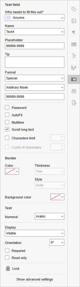
- Who needs to fill this out? - choose the recipient role to set the group of users who can fill in this field.
- Name - enter the field name manually, or choose one from the list if you have already created names for other fields. Fields with the same name share the same value.
- Placeholder - enter the text displayed in the empty field.
- Tip - enter the text displayed when a user hovers the mouse pointer over the field.
- Format - choose the content format of the field from the list: None, Number, Percentage, Date, Time, Special, or Custom. To learn more about the format options, please read the Format section below.
- Password - check this box to hide the entered characters.
- AutoFit - check this box to automatically fit the font size to the field size.
- Multiline - check this box to allow entering text in multiple lines. Otherwise, the text occupies a single line.
- Scroll long text - check this box to allow scrolling the text that exceeds the field size.
- Characters limit - check this box and enter the maximum number of characters allowed in the field.
- Comb of characters - check this box to spread the characters evenly across the field. To use this option, set the Characters limit first.
- Border - set the border Color, Thickness and Style, as well as the Background Color of the field.
- Text - choose the numerals used in the field: Arabic or Hindi.
- Display - choose how the field is displayed: Visible, Hidden, Visible but doesn't print, or Hidden but printable.
- Orientation - enter the rotation angle of the field in degrees.
- Required - check this box to make the field mandatory to fill in.
- Read only - check this box to prevent users from changing the field value.
To open more settings, click the Show advanced settings link in the Form settings menu. To learn more, please read the Advanced settings section below.
Creating a credit card field
Credit card fields are used to enter credit card numbers. By default, the Format of the field is set to Special, with the Arbitrary Mask option and the 9999-9999-9999-9999 mask.
To insert a credit card field:
- Switch to the Forms tab of the top toolbar.
- Click the
 Credit Card button.
The field will be added at the cursor position, and the Form settings menu will open on the right sidebar.
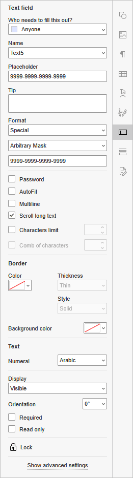
- Who needs to fill this out? - choose the recipient role to set the group of users who can fill in this field.
- Name - enter the field name manually, or choose one from the list if you have already created names for other fields. Fields with the same name share the same value.
- Placeholder - enter the text displayed in the empty field.
- Tip - enter the text displayed when a user hovers the mouse pointer over the field.
- Format - choose the content format of the field from the list: None, Number, Percentage, Date, Time, Special, or Custom. To learn more about the format options, please read the Format section below.
- Password - check this box to hide the entered characters.
- AutoFit - check this box to automatically fit the font size to the field size.
- Multiline - check this box to allow entering text in multiple lines. Otherwise, the text occupies a single line.
- Scroll long text - check this box to allow scrolling the text that exceeds the field size.
- Characters limit - check this box and enter the maximum number of characters allowed in the field.
- Comb of characters - check this box to spread the characters evenly across the field. To use this option, set the Characters limit first.
- Border - set the border Color, Thickness and Style, as well as the Background Color of the field.
- Text - choose the numerals used in the field: Arabic or Hindi.
- Display - choose how the field is displayed: Visible, Hidden, Visible but doesn't print, or Hidden but printable.
- Orientation - enter the rotation angle of the field in degrees.
- Required - check this box to make the field mandatory to fill in.
- Read only - check this box to prevent users from changing the field value.
To open more settings, click the Show advanced settings link in the Form settings menu. To learn more, please read the Advanced settings section below.
Moving and resizing form fields
To move a form field, drag it to the required position on the page.
To resize a form field, drag one of the squares on its border.
Creating required fields
To make a field required, check the Required option in the Form settings menu. Required fields are marked with a red border.
Locking form fields
To prevent further editing of the inserted form field, click the  Lock button in the Form settings menu. Users can still fill in the field.
Removing form fields
To remove a form field, select it and press the Delete key on the keyboard. Locked fields cannot be removed, so if the field is locked, click the Lock button in the Form settings menu to unlock it first.
Assigning the order of filling
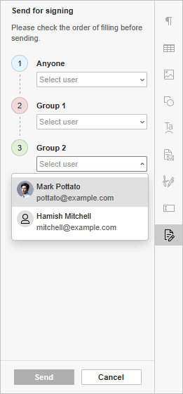
You can assign the order in which recipients fill in and sign the form:
- When the form is ready, click the Share & collect button on the top toolbar.
- Click the Send for signing button on the right panel.
- Check the order of signing. To change it, reassign the roles using the drop-down menu.
- You can track the form filling process using the stepper on the right panel.
Advanced settings
To open more settings for a form field, select the field and click the Show advanced settings link in the Form settings menu. The advanced settings window will open. The available tabs depend on the field type:
- Text fields, combo boxes, email address, phone number, date and time, ZIP code, and credit card fields have all four tabs: Format, Validate, Calculate and Actions.
- List boxes, checkboxes, radio buttons, image and signature fields have only the Actions tab.