Insert autoshapes
Insert an autoshape
- select the worksheet you want to put the shape onto,
- tap the
 icon at the top toolbar to open the new object insertion panel,
 - switch to the
 tab,
tab, - select one of the available autoshapes.
The selected autoshape will be added. Now you can change its properties and position.
Adjust the shape settings
- select the shape by tapping its border (the rectangular box around the shape should be displayed as a solid line),
- open the Shape settings panel by
- tapping the
 icon at the top toolbar, or
 - tapping the Edit option in the pop-up menu,
- tapping the
- tap the necessary menu item: Style, Change Shape or Arrange. Use the
 icon on the left to return to the previous settings section.
The Style section contains the following three tabs:
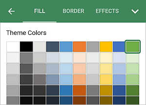
- FILL - to fill the inner space of the autoshape with a solid color. Swipe up to see all the palettes and tap the necessary color on the Theme Colors or Standard Colors palette or create your own Custom Color. If you don't want to use any fill, tap the
 icon on the Standard Colors palette.
To add a new Custom Color, follow these steps:
- go to the Add Custom Color menu,
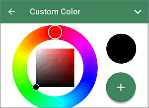
- using the color palette, choose the necessary color and select its hue level,
- tap the
 button to apply the color to the selected autoshape.
The added color will also be placed in the Custom Colors section, where the recently used custom colors are located.
- go to the Add Custom Color menu,
- BORDER - to set the border Size by dragging the slider and select the border Color on the palette,
- EFFECTS - to set the Opacity level by dragging the slider. The default value is 100%. It corresponds to the full opacity. The 0% value corresponds to the full transparency.
The Change Shape section allows to replace the current autoshape with another one selected from the menu.
The Arrange section allows to to set the selected autoshape position as related to other objects when several objects overlap each other. To learn more, please refer to the Manipulate objects section of this guide.
- FILL - to fill the inner space of the autoshape with a solid color. Swipe up to see all the palettes and tap the necessary color on the Theme Colors or Standard Colors palette or create your own Custom Color. If you don't want to use any fill, tap the
- close the shape settings panel by tapping the
 arrow on the right.
Add text within the autoshape
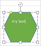
- place the insertion point by by tapping inside the autoshape (the rectangular box around the shape should be displayed as a dashed line),
- start typing your text using the on-screen keyboard.
The text you add in this way becomes a part of the autoshape (when you move or rotate the shape, the text moves or rotates with it).
To edit the added text within the autoshape,
- select the text: double tap a piece of text within the shape and drag the selection handles,
- open the shape/text settings panel by
- tapping the
icon at the top toolbar, or
- tapping the Edit option in the pop-up menu,
- tapping the
- switch to the TEXT tab,
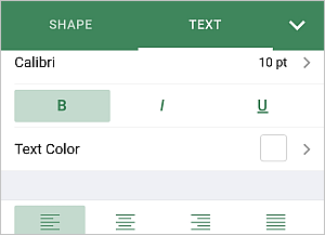
- adjust the necessary text parameters:
- Tap the font name displayed on the left (e.g. Calibri) and select a different font from the list of the available ones.
- Tap the font size displayed on the right (e.g. 11 pt) and use the
 or
or
 arrows to decrease or increase the current value.
 - To change the font typeface, select one of the following options:
-
 Bold - tap this icon to make the font bold giving it more weight.
 -
 Italic - tap this icon to make the font italicized giving it some right side tilt.
 -
 Underline - tap this icon to make the text underlined with the line going under the letters.
-
- Text Color - is used to change the color of the characters in the text. Tap this option to open the the color palettes panel (swipe up to see more colors). Select the necessary color on the Theme Colors or Standard Colors palette.
- Apply the necessary horizontal alignment type:
tap the
 icon
to line up the text by the left side of the text box (the right side remains unaligned).
icon
to line up the text by the left side of the text box (the right side remains unaligned).tap the
 icon
to line up the text by the center of the text box (the right and the left sides remains unaligned).
icon
to line up the text by the center of the text box (the right and the left sides remains unaligned).tap the
 icon
to line up the text by the right side of the text box (the left side remains unaligned).
icon
to line up the text by the right side of the text box (the left side remains unaligned).tap the
 icon
to line up the text by both the left and the right sides of the text box (additional spacing is added where necessary to keep the alignment).
icon
to line up the text by both the left and the right sides of the text box (additional spacing is added where necessary to keep the alignment). - Swipe up to see the vertical alignment parameters and apply one of alignment types:
tap the
 icon to align your text to the top of the text box;
tap the
 icon to align your text to the middle of the text box;
tap the
 icon to align your text to the bottom of the text box.
- close the shape/text settings panel by tapping the arrow on the right or use the icon on the left to return to the previous settings section.
Remove the shape
Select the shape by tapping on it and proceed in one of the following ways:
- tap the Delete option in the pop-up menu, or
- open the shape settings panel by tapping the
icon at the top toolbar, swipe up and tap the REMOVE SHAPE button.