Inserting and formatting autoshapes
Insert an autoshape
To add an autoshape in the Spreadsheet Editor,
- switch to the Insert tab of the top toolbar,
- click the
 Shape icon on the top toolbar,
 - select one of the available autoshape groups from the Shape Gallery: Recently Used, Basic Shapes, Figured Arrows, Math, Charts, Stars & Ribbons, Callouts, Buttons, Rectangles, Lines,
- click the necessary autoshape within the selected group,
- place the mouse cursor where the shape should be added,
- once the autoshape is added, you can change its size and position as well as its settings. You can save the autoshape as a picture on your hard drive using the Save as picture option in the right-click menu.
Copy autoshape style formatting
To copy a certain autoshape style formatting,
- select the autoshape whose formatting you need to copy with the mouse or using the keyboard,
- click the Copy style
 icon on the Home tab of the top toolbar (the mouse pointer will look like this
  ),
), - select the required autoshape to apply the same formatting.
Adjust the autoshape settings
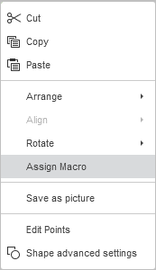
- Cut, Copy, Paste - standard options which are used to cut or copy the selected text/object and paste the previously cut/copied text passage or object to the current cursor position.
- Arrange is used to bring the selected autoshape to foreground, send it to background, move forward or backward as well as group or ungroup shapes to perform operations with several of them at once. To learn more on how to arrange objects, please refer to this page.
- Align is used to align the shape to the left, in the center, to the right, at the top, in the middle, at the bottom. To learn more on how to align objects, please refer to this page.
- Rotate is used to rotate the shape by 90 degrees clockwise or counterclockwise, as well as to flip the shape horizontally or vertically.
- Assign Macro is used to provide a quick and easy access to a macro within a spreadsheet by assigning a macro to any shape. Once you assign a macro, the shape appears as a button control, and you can run the macro whenever you click it. To learn more, please refer to the Assign a Macro to a Shape section of this guide.
- Save as picture is used to save the shape as a picture on your hard drive.
- Edit Points is used to customize or to change the curvature of your shape.
- To activate a shape’s editable anchor points, right-click the shape and choose Edit Points from the menu, or click the Edit shape > Edit points option on the right panel. The black squares that become active are the points where two lines meet, and the red line outlines the shape. Click and drag it to reposition the point, and to change the shape outline.
-
Once you click the anchor point, two blue lines with white squares at the ends will appear. These are Bézier handles that allow you to create a curve and to change a curve’s smoothness.

-
As long as the anchor points are active, you can add and delete them.
To add a point to a shape, hold Ctrl and click the position where you want to add an anchor point.
To delete a point, hold Ctrl and click the unnecessary point.
- Shape Advanced Settings is used to open the 'Shape - Advanced Settings' window.
Some of the autoshape settings can be changed using the Shape settings tab on the right sidebar that will open if you select the inserted autoshape with the mouse and click the Shape settings icon. The following settings can be changed:
- Fill - use this section to select the autoshape fill. You can choose the following options:
- Color Fill - select this option to specify a solid color to fill the inner space of the selected autoshape.
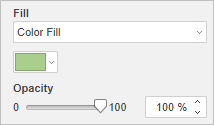
Click the colored box below and select the necessary color from the available color sets or specify any color you like:
- Theme Colors - the colors that correspond to the selected color scheme of the spreadsheet.
- Standard Colors - the default colors set.
-
You can also apply a custom color using two different options:
- Eyedropper - use this option to choose the required color by clicking it in the document.
- More colors - click this caption if the required color is missing among the available palettes. Select the necessary color range moving the vertical color slider and set a specific color dragging the color picker within the large square color field. Once you select a color with the color picker, the appropriate RGB and sRGB color values will be displayed in the fields on the right. You can also define a color on the base of the RGB color model by entering the corresponding numeric values into the R, G, B (red, green, blue) fields or enter the sRGB hexadecimal code into the field marked with the # sign. The selected color appears in the New preview box. If the object was previously filled with any custom color, this color is displayed in the Current box so you can compare the original and modified colors. When the color is defined, click the Add button:
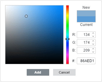
The custom color will be applied to the selected element and added to the Recent colors palette.
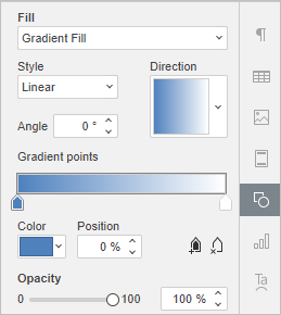
- Gradient Fill - use this option to fill the shape with two or more fading colors. Customize your gradient fill with no constraints. Click the Shape settings
 icon to open the Fill menu on the right sidebar:
Available menu options:
- Style - choose between Linear or Radial:
- Linear is used when you need your colors to flow from left-to-right, top-to-bottom, or at any angle you chose in a single direction. The Direction preview window displays the selected gradient color, click the arrow to choose a preset gradient direction. Use Angle settings for a precise gradient angle.
- Radial is used to move from the center, as it starts at a single point and emanates outward.
- Gradient Point is a specific point for transition from one color to another.
- Use the
 Add Gradient Point button or slider bar to add a gradient point. You can add up to 10 gradient points. Each next gradient point added will in no way affect the current gradient fill appearance. Use the
  Remove Gradient Point button to delete a certain gradient point.
 - Use the slider bar to change the location of the gradient point or specify Position in percentage for precise location.
- To apply a color to a gradient point, click a point on the slider bar, and then click Color to choose the color you want.
- Use the
- Style - choose between Linear or Radial:
- Picture or Texture - select this option to use an image or a predefined texture as the shape background.
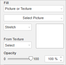
- If you wish to use an image as the shape background, you can click the Select Picture button and add an image From File selecting it on the hard disc drive of your computer, From Storage using your ONLYOFFICE file manager, or From URL inserting the appropriate URL address into the opened window.
-
If you wish to use a texture as the shape background, open the From Texture menu and select the necessary texture preset.
Currently, the following textures are available: canvas, carton, dark fabric, grain, granite, grey paper, knit, leather, brown paper, papyrus, wood.
-
In case the selected Picture has less or more dimensions than the autoshape has, you can choose the Stretch or Tile setting from the dropdown list.
The Stretch option allows you to adjust the size of the image to fit the autoshape so that it could fill all the space completely.
The Tile option allows you to display only a part of the bigger image keeping its original dimensions, or repeat the smaller image keeping its original dimensions over the autoshape surface so that it could fill the space completely.
Note: any selected Texture preset fills the space completely, but you can apply the Stretch effect if necessary.
- Pattern - select this option to fill the shape with a two-colored design composed of regularly repeated elements.
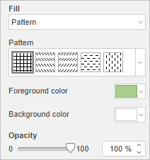
- Pattern - select one of the predefined designs from the menu.
- Foreground color - click this color box to change the color of the pattern elements.
- Background color - click this color box to change the color of the pattern background.
- No Fill - select this option if you don't want to use any fill.
- Color Fill - select this option to specify a solid color to fill the inner space of the selected autoshape.
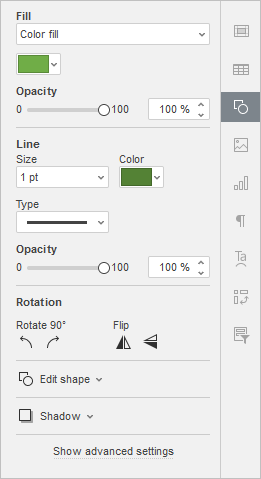
- Opacity - use this section to set the Opacity level by dragging the slider or entering the percent value manually. The default value is 100%. It means full opacity. The 0% value means full transparency.
- Line - use this section to change the width, color or type of the autoshape line.
- To change the line width, select one of the available options from the Size dropdown list. The available options are: 0.5 pt, 1 pt, 1.5 pt, 2.25 pt, 3 pt, 4.5 pt, 6 pt. Alternatively, select the No Line option if you don't want to use any line.
- To change the line color, click on the colored box below and select the necessary color.
- To change the line type, select the necessary option from the corresponding dropdown list (a solid line is applied by default, you can change it to one of the available dashed lines).
- To change the line opacity, enter the required value manually or use the corresponding slider bar.
- Rotation is used to rotate the shape by 90 degrees clockwise or counterclockwise, as well as to flip the shape horizontally or vertically. Click one of the buttons:
 to rotate the shape by 90 degrees counterclockwise
 to rotate the shape by 90 degrees clockwise
 to flip the shape horizontally (left to right)
 to flip the shape vertically (upside down)
- Edit shape - use this section to edit the shape points or to replace the current autoshape with another one selected from the dropdown list.
- Edit points is used to customize or to change the curvature of your shape.
-
Once you click the anchor point, two blue lines with white squares at the ends will appear. These are Bézier handles that allow you to create a curve and to change a curve’s smoothness.
-
As long as the anchor points are active, you can add and delete them.
To add a point to a shape, hold Ctrl and click the position where you want to add an anchor point.
To delete a point, hold Ctrl and click the unnecessary point.
-
Once you click the anchor point, two blue lines with white squares at the ends will appear. These are Bézier handles that allow you to create a curve and to change a curve’s smoothness.
- Change Shape is used to replace the current autoshape. Choose another autoshape from the dropdown list.
- Edit points is used to customize or to change the curvature of your shape.
- Adjust Shadow - create a custom shadow using the following sliders:
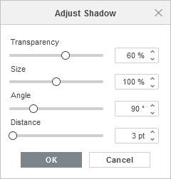
- Transparency - adjust the transparency of the shadow.
- Size - adjust the size of the shadow.
- Angle - adjust the angle of the shadow relative to its object.
- Distance - adjust the distance of the shadow from its object.
Adjust shape advanced settings
To change the advanced settings of the autoshape, use the Show advanced settings link on the right sidebar. The 'Shape - Advanced Settings' window will open:
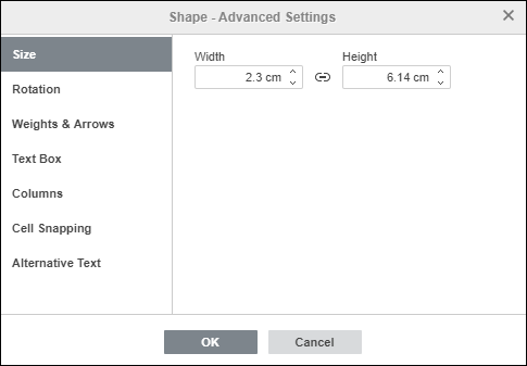
The Size tab contains the following parameters:
- Width and Height - use these options to change the width and/or height of the autoshape. If the Constant proportions
 button is clicked (in this case it looks like this
  ), the width and height will be changed together, preserving the original shape aspect ratio.
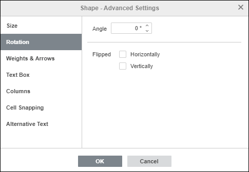
The Rotation tab contains the following parameters:
- Angle - use this option to rotate the shape by an exactly specified angle. Enter the necessary value measured in degrees into the field or adjust it using the arrows on the right.
- Flipped - check the Horizontally box to flip the shape horizontally (left to right) or check the Vertically box to flip the shape vertically (upside down).
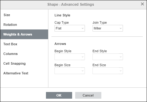
The Weights & Arrows tab contains the following parameters:
- Line Style - this option group allows you to specify the following parameters:
- Cap Type - this option allows you to set the style of the end of the line, therefore it can be applied only to the shapes with an open outline, such as lines, polylines, etc.:
- Flat - the end points will be flat.
- Round - the end points will be rounded.
- Square - the end points will be square.
- Join Type - this option allows you to set the style of the intersection of two lines, for example, it can affect a polyline or the corners of a triangle or rectangle outline:
- Round - the corner will be rounded.
- Bevel - the corner will be cut off at an angle.
- Miter - the corner will be pointed. It goes well to shapes with sharp angles.
Note: the effect will be more noticeable if you use a large outline width.
- Cap Type - this option allows you to set the style of the end of the line, therefore it can be applied only to the shapes with an open outline, such as lines, polylines, etc.:
- Arrows - this option group is available if a shape from the Lines shape group is selected. It allows you to set the arrow Start and End Style and Size by selecting the appropriate option from the dropdown lists.
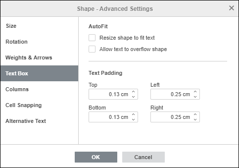
The Text Box tab allows you to Resize shape to fit text, Allow text to overflow shape or change the Top, Bottom, Left and Right internal margins of the autoshape (i.e., the distance between the text within the shape and the autoshape borders).
Note: this tab is only available if text is added within the autoshape, otherwise the tab is disabled.
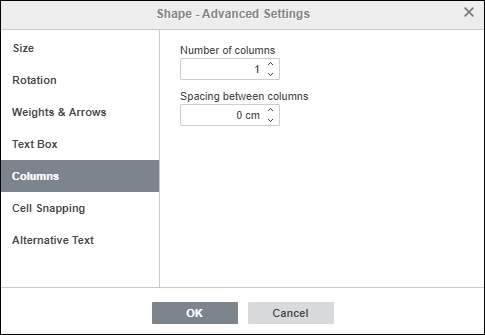
The Columns tab allows you to add columns of text within the autoshape specifying the necessary Number of columns (up to 16) and Spacing between columns. Once you click OK, the text that already exists or any other text you enter within the autoshape will appear in columns and will flow from one column to another one.
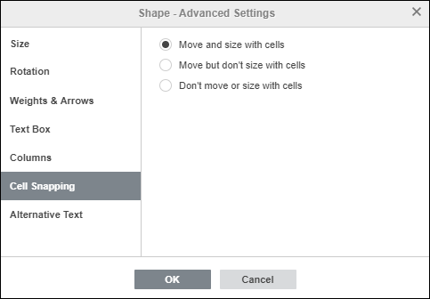
The Cell Snapping tab contains the following parameters:
- Move and size with cells - this option allows you to snap the shape to the cell behind it. If the cell moves (e.g. if you insert or delete some rows/columns), the shape will be moved together with the cell. If you increase or decrease the width or height of the cell, the shape will change its size as well.
- Move but don't size with cells - this option allows you to snap the shape to the cell behind it, preventing the shape from being resized. If the cell moves, the shape will be moved together with the cell, but if you change the cell size, the shape dimensions remain unchanged.
- Don't move or size with cells - this option allows you to prevent the shape from being moved or resized if the cell position or size was changed.
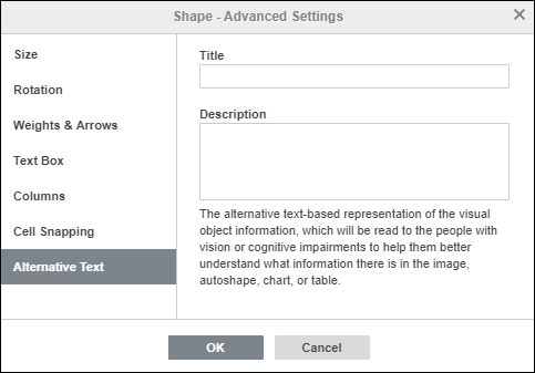
The Alternative Text tab allows you to specify the Title and Description which will be read to people with vision or cognitive impairments to help them better understand what information the shape contains.
Insert and format text within the autoshape
To insert a text into the autoshape, select the shape with the mouse and start typing your text. The text will become part of the autoshape (when you move or rotate the shape, the text also moves or rotates with it).
All the formatting options you can apply to the text within the autoshape are listed here.
Join autoshapes using connectors
You can connect autoshapes using lines with connection points to demonstrate dependencies between the objects (e.g., if you want to create a flowchart). To do that,
- click the Shape icon on the Insert tab of the top toolbar,
-
select the Lines group from the menu,
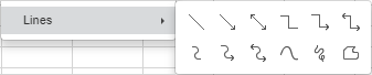
- click the necessary shape within the selected group (excepting the last three shapes which are not connectors, namely Curve, Scribble and Freeform),
-
hover the mouse cursor over the first autoshape and click one of the connection points
 that appear on the shape outline,

-
drag the mouse cursor towards the second autoshape and click the necessary connection point on its outline.

If you move the joined autoshapes, the connector remains attached to the shapes and moves together with them.

You can also detach the connector from the shapes and then attach it to any other connection points.
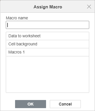
Assign a macro to a shape
You can provide a quick and easy access to a macro within a spreadsheet by assigning a macro to any shape. Once you assign a macro, the shape appears as a button control, and you can run the macro whenever you click it.
To assign a macro:
-
Right-click the shape to assign a macro to and choose the Assign Macro option from the drop-down menu.
- The Assign Macro dialogue will open
-
Choose a macro from the list, or type in the macro name, and click OK to confirm.