Managing third-party forms
ONLYOFFICE Document Editor allows you to effortlessly create fillable forms in your documents, e.g., agreement drafts or surveys.
As of version 9.0, ONLYOFFICE supports editing the third-party created forms in the ONLYOFFICE PDF Editor.
Creating fillable forms is enabled through user-editable objects that ensure overall consistency of the resulting documents and allow for advanced form interaction experience.
Currently, you can insert editable text fields, combo boxes, list boxes, checkboxes, radio buttons, assign designated areas for images, as well as create email address, phone number, date and time, zip code, and credit card fields. Access these features on the Forms tab that is available for PDF files only.
Creating a new Text Field
Text fields are user-editable plain text form fields; no other objects can be added.
To insert a text field,
- place the insertion point within a line of the text where you want the field to be added,
- switch to the Forms tab of the top toolbar,
- click the
 Text Field icon.
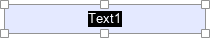
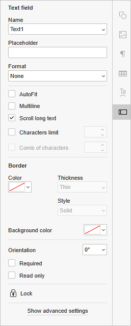
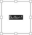
The form field will appear as a graphic object in the middle of the page. The Form settings menu will open to the right.
- Name: enter the name of the field that will serve as a group designation.
- Placeholder: type in the text to be displayed in the inserted text field.
- Format: choose the content format of the text field, i.e., only the chosen character format will be allowed: None, Number, Percentage, Date, Time, Special, Regular Expression (the text shall correspond with the custom expression).
When you choose a Date, Time, Special or Regular Expression format, an additional field below the Format field appears.
- AutoFit: check the box to automatically fit the font size to the field size.
- Multiline: check the box to create a form field with multiple lines, otherwise, the text will occupy a single line.
- Scroll long text: this setting is enabled by default.
- Characters limit: no limits by default; check this box to set the maximum characters number in the field to the right.
- Comb of characters: disable the Scroll long text option to unlock the comb of characters. It will spread the text evenly within the inserted text field and configure its general appearance. Leave the box unchecked to preserve the default settings.
- Border color: click the icon
 to set the color for the borders of the inserted text field. Choose the preferred border color from the palette. You can add a new custom color if necessary. When you pick a color, the following options will become available:
- Thickness - choose whether you want the borders to be thin, medium or thick.
- Style - adjust the style of the borders: Solid, Dashed, Underline, Beveled or Inset.
- Background color: click the icon to apply a background color to the inserted text field. Choose the preferred color out of the standard colors, or add a new custom color if necessary.
- Orientation: choose one of the available presets to set the orientation of the text.
- Required: check this box to make the text field a necessary one to fill in.
- Read only: check this box to prohibit editing the text field.
Creating a new Combo box
Combo boxes contain a dropdown list with a set of choices that can be edited by users.
To insert a combo box,
- place the insertion point within a line of the text where you want the field to be added,
- switch to the Forms tab of the top toolbar,
- click the
 Combo box icon.
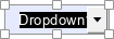
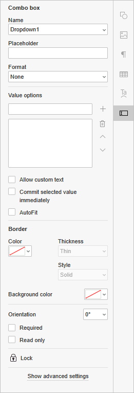
The form field will appear as a graphic object in the middle of the page. The Form settings menu will open to the right.
- Name: enter the name of the field that will serve as a group designation.
- Placeholder: type in the text to be displayed in the inserted combo box.
- Format: choose the content format of the combo box field, i.e., only the chosen character format will be allowed: None, Number, Percentage, Date, Time, Special, Regular Expression (the text shall correspond with the custom expression).
When you choose a Date, Time, Special or Regular Expression format, an additional field below the Format field appears.
- Value Options: add
 new values, delete
  them, or move them up
  and
and  down in the list.
 - Allow custom text: allows custom text entries.
- Commit selected value immediately: the value chosen by users is saved and displayed in real time.
- AutoFit: check the box to automatically fit the font size to the field size.
- Border color: click the icon to set the color for the borders of the inserted combo box field. Choose the preferred border color from the palette. You can add a new custom color if necessary. When you pick a color, the following options will become available:
- Thickness - choose whether you want the borders to be thin, medium or thick.
- Style - adjust the style of the borders: Solid, Dashed, Underline, Beveled or Inset.
- Background color: click the icon to apply a background color to the inserted combo box field. Choose the preferred color out of the standard colors, or add a new custom color if necessary.
- Orientation: choose one of the available presets to set the orientation of the text.
- Required: check this box to make the combo box field a necessary one to fill in.
- Read only: check this box to prohibit editing the combo box field.
Creating a new List Box field
List boxes contain a list with a set of choices that cannot be edited by the users.
To insert a list box,
- place the insertion point within a line of the text where you want the field to be added,
- switch to the Forms tab of the top toolbar,
- click the
 List Box icon.
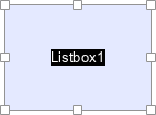
The form field will appear as a graphic object in the middle of the page. The Form settings menu will open to the right.
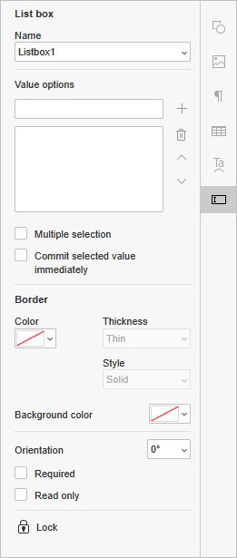
- Name: enter the name of the field that will serve as a group designation.
- Value Options: add new values, delete them, or move them up and down in the list.
- Multiple selection: enable multiple choice.
- Commit selected value immediately: the value chosen by users is saved and displayed in real time.
- Border color: click the icon to set the color for the borders of the inserted list box field. Choose the preferred border color from the palette. You can add a new custom color if necessary. When you pick a color, the following options will become available:
- Thickness - choose whether you want the borders to be thin, medium or thick.
- Style - adjust the style of the borders: Solid, Dashed, Underline, Beveled or Inset.
- Background color: click the icon to apply a background color to the inserted list box field. Choose the preferred color out of the standard colors, or add a new custom color if necessary.
- Orientation: choose one of the available presets to set the orientation of the text.
- Required: check this box to make the list box field a necessary one to fill in.
- Read only: check this box to prohibit editing the list box field.
Creating a new Checkbox
Checkboxes are used to provide users with a variety of options, any number of which can be selected. Checkboxes operate individually, so they can be checked or unchecked independently.
To insert a checkbox,
- place the insertion point within a line of the text where you want the field to be added,
- switch to the Forms tab of the top toolbar,
- click the
 Checkbox icon.

The form field will appear as a graphic object in the middle of the page. The Form settings menu will open to the right.
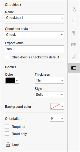
- Name: enter the name of the field that will serve as a group designation.
- Checkbox style: choose the desired checkbox style out of the presets, i.e., Check, Cross, Square, Diamond, Circle, Star.
- Export value: set the way the end result is displayed after the form is filled out.
- Checkbox is checked by default: check this box so that the checkbox field is activated by default.
- Border color: click the icon to set the color for the borders of the inserted checkbox field. Choose the preferred border color from the palette. You can add a new custom color if necessary. When you pick a color, the following options will become available:
- Thickness - choose whether you want the borders to be thin, medium or thick.
- Style - adjust the style of the borders: Solid, Dashed, Underline, Beveled or Inset.
- Background color: click the icon to apply a background color to the inserted checkbox field. Choose the preferred color out of the standard colors, or add a new custom color if necessary.
- Orientation: choose one of the available presets to set the orientation of the text.
- Required: check this box to make the checkbox field a necessary one to fill in.
- Read only: check this box to prohibit editing the checkbox field.
Creating a new Radio Button
Radio buttons are used to provide users with a variety of options, only one of which can be selected. Radio buttons can be grouped so that there is no selecting several buttons within one group.
To insert a radio button,
- place the insertion point within a line of the text where you want the field to be added,
- switch to the Forms tab of the top toolbar,
- click the
 Radio Button icon.

The form field will appear as a graphic object in the middle of the page. The Form settings menu will open to the right.
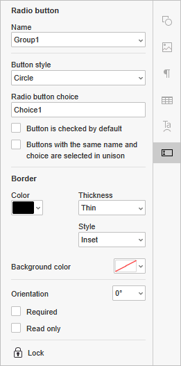
- Name: enter the name of the field that will serve as a group designation.
- Button style: choose the desired checkbox style out of the presets, i.e., Check, Cross, Square, Diamond, Circle, Star.
- Radio button choice: type in the text used as a name for the element.
- Button is checked by default: check this box so that the radio button field is activated by default.
- Buttons with the same name and choice are selected in unison: if the Name and the Radio button choice fields have the same value, the corresponding radio buttons will be checked at the same time.
- Border color: click the icon to set the color for the borders of the inserted radio button field. Choose the preferred border color from the palette. You can add a new custom color if necessary. When you pick a color, the following options will become available:
- Thickness - choose whether you want the borders to be thin, medium or thick.
- Style - adjust the style of the borders: Solid, Dashed, Underline, Beveled or Inset.
- Background color: click the icon to apply a background color to the inserted radio button field. Choose the preferred color out of the standard colors, or add a new custom color if necessary.
- Orientation: choose one of the available presets to set the orientation of the text.
- Required: check this box to make the radio button field a necessary one to fill in.
- Read only: check this box to prohibit editing the radio button field.
Creating a new Image field
Images are form fields which are used to enable inserting an image with the limitations you set, i.e., the location of the image or its size.
To insert an image form field,
- place the insertion point within a line of the text where you want the field to be added,
- switch to the Forms tab of the top toolbar,
- click the
 Image icon.
The form field will appear as a graphic object in the middle of the page. The Form settings menu will open to the right.
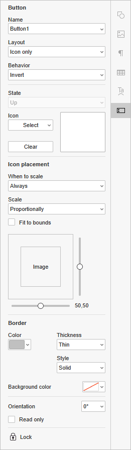
- Name: enter the name of the field that will serve as a group designation.
- Layout: choose the preferred layout type out of the presets. When you pick an option containing labels, the corresponding field appears below.
- Behavior: set the required behavior of the field.
- None - no specific behavior is set.
- Push - sets the behavior of the field for the Up, Down, and Rollover states.
- Outline - the border of the field is highlighted.
- Invert - the light and dark colours of the field are reverted.
- State: set the required state for the Push behavior.
- Up - the state of the field when the mouse button is not clicked.
- Down - the state of the field when the mouse button is clicked and held.
- Rollover - the state of the field when the mouse cursor is hovering over it.
- Icon: click this button to upload an image either From file, From URL, or From storage. Click the Clear button to delete the image.
- When to scale: set the image scaling mode:
- Always - no matter its size, the image will always be scaled.
- Never - no matter its size, the image will never be scaled.
- Image is too big - the image will be scaled only if its size exceeds the field.
- Image is too small - the image will be scaled only if the field size is too big for it.
- Scale - set whether you want the image to be scaled proportionally or non-proportionally, i.e., preserving the original image height and width or not.
- Fit to bounds - set whether the image should fit the borders of the field form, or whether there should be some space left.
- You can adjust the image positioning horizontally and/or vertically by dragging the sliders.
- Border color: click the icon to set the color for the borders of the inserted image field. Choose the preferred border color from the palette. You can add a new custom color if necessary. When you pick a color, the following options will become available:
- Thickness - choose whether you want the borders to be thin, medium or thick.
- Style - adjust the style of the borders: Solid, Dashed, Underline, Beveled or Inset.
- Background color: click the icon to apply a background color to the inserted image field. Choose the preferred color out of the standard colors, or add a new custom color if necessary.
- Orientation: choose one of the available presets to set the orientation of the image.
- Read only: check this box to prohibit editing the image field.
Creating a new Email Address field
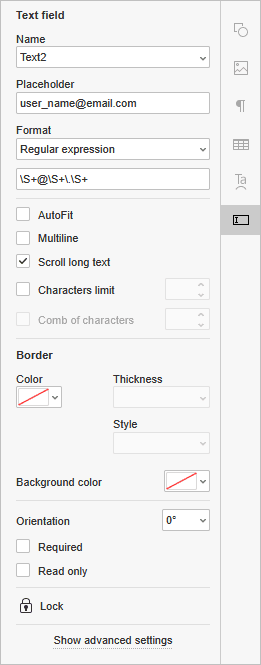
Email Address field is used to type in an email address corresponding to a regular expression \S+@\S+\.\S+.
To insert an email address field,
- place the insertion point within a line of the text where you want the field to be added,
- switch to the Forms tab of the top toolbar,
- click the
 Email Address icon.
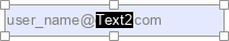
The form field will appear as a graphic object in the middle of the page. The Form settings menu will open to the right.
- Name: enter the name of the field that will serve as a group designation.
- Placeholder: type in the text to be displayed in the inserted email address form field; “user_name@email.com” is set by default.
- Format: choose the content format of the email address field, i.e., only the chosen character format will be allowed: None, Number, Percentage, Date, Time, Special, Regular Expression (the text shall correspond with the custom expression).
When you choose a Date, Time, Special or Regular Expression format, an additional field below the Format field appears.
- AutoFit: check the box to automatically fit the font size to the field size.
- Multiline: check the box to create a form field with multiple lines, otherwise, the text will occupy a single line.
- Scroll long text: this setting is enabled by default.
- Characters limit: no limits by default; check this box to set the maximum characters number in the field to the right.
- Comb of characters: disable the Scroll long text option to unlock the comb of characters. It will spread the text evenly within the inserted email address field and configure its general appearance. Leave the box unchecked to preserve the default settings.
- Border color: click the icon to set the color for the borders of the inserted email address field. Choose the preferred border color from the palette. You can add a new custom color if necessary. When you pick a color, the following options will become available:
- Thickness - choose whether you want the borders to be thin, medium or thick.
- Style - adjust the style of the borders: Solid, Dashed, Underline, Beveled or Inset.
- Background color: click the icon to apply a background color to the inserted email address field. Choose the preferred color out of the standard colors, or add a new custom color if necessary.
- Orientation: choose one of the available presets to set the orientation of the text.
- Required: check this box to make the email address field a necessary one to fill in.
- Read only: check this box to prohibit editing the email address field.
Creating a new Phone Number field
Phone Number field is used to type in a phone number corresponding to an arbitrary mask given by the form creator. It is set to (999)999-9999 by default.
To insert a phone number field,
- place the insertion point within a line of the text where you want the field to be added,
- switch to the Forms tab of the top toolbar,
- click the
 Phone Number icon.
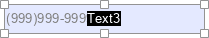
The form field will appear as a graphic object in the middle of the page. The Form settings menu will open to the right.
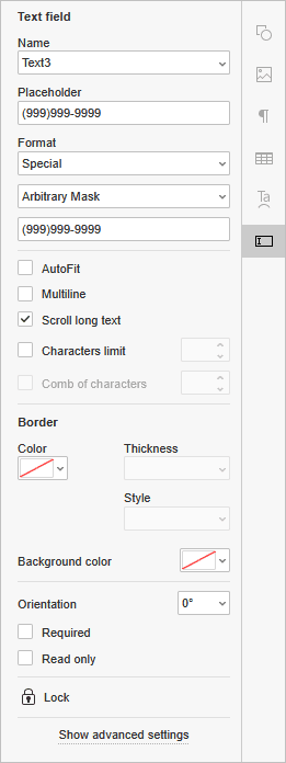
- Name: enter the name of the field that will serve as a group designation.
- Placeholder: type in the text to be displayed in the inserted phone number form field; “(999)999-9999” is set by default.
- Format: choose the content format of the phone number field, i.e., only the chosen character format will be allowed: None, Number, Percentage, Date, Time, Special, Regular Expression (the text shall correspond with the custom expression).
When you choose a Date, Time, Special or Regular Expression format, an additional field below the Format field appears.
- AutoFit: check the box to automatically fit the font size to the field size.
- Multiline: check the box to create a form field with multiple lines, otherwise, the text will occupy a single line.
- Scroll long text: this setting is enabled by default.
- Characters limit: no limits by default; check this box to set the maximum characters number in the field to the right.
- Comb of characters: disable the Scroll long text option to unlock the comb of characters. It will spread the text evenly within the inserted phone number field and configure its general appearance. Leave the box unchecked to preserve the default settings.
- Border color: click the icon to set the color for the borders of the inserted phone number field. Choose the preferred border color from the palette. You can add a new custom color if necessary. When you pick a color, the following options will become available:
- Thickness - choose whether you want the borders to be thin, medium or thick.
- Style - adjust the style of the borders: Solid, Dashed, Underline, Beveled or Inset.
- Background color: click the icon to apply a background color to the inserted phone number field. Choose the preferred color out of the standard colors, or add a new custom color if necessary.
- Orientation: choose one of the available presets to set the orientation of the text.
- Required: check this box to make the phone number field a necessary one to fill in.
- Read only: check this box to prohibit editing the phone number field.
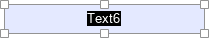
Creating a new Date and Time field
Date and Time field is used to insert a date. The date is set to DD/MM/YYYY by default.
To insert a date and time field,
- place the insertion point within a line of the text where you want the field to be added,
- switch to the Forms tab of the top toolbar,
- click the
 Date and Time icon.
The form field will appear as a graphic object in the middle of the page. To enter a date, click the dropdown arrow within the field and choose the required date via the calendar. The Form settings menu will open to the right.
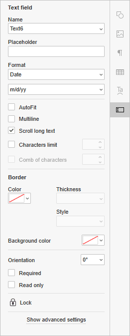
- Name: enter the name of the field that will serve as a group designation.
- Placeholder: type in the text to be displayed in the inserted date and time form field.
- Format: choose the content format of the date and time field, i.e., only the chosen character format will be allowed: None, Number, Percentage, Date, Time, Special, Regular Expression (the text shall correspond with the custom expression).
When you choose a Date, Time, Special or Regular Expression format, an additional field below the Format field appears.
- AutoFit: check the box to automatically fit the font size to the field size.
- Multiline: check the box to create a form field with multiple lines, otherwise, the text will occupy a single line.
- Scroll long text: this setting is enabled by default.
- Characters limit: no limits by default; check this box to set the maximum characters number in the field to the right.
- Comb of characters: disable the Scroll long text option to unlock the comb of characters. It will spread the text evenly within the inserted date and time field and configure its general appearance. Leave the box unchecked to preserve the default settings.
- Border color: click the icon to set the color for the borders of the inserted date and time field. Choose the preferred border color from the palette. You can add a new custom color if necessary. When you pick a color, the following options will become available:
- Thickness - choose whether you want the borders to be thin, medium or thick.
- Style - adjust the style of the borders: Solid, Dashed, Underline, Beveled or Inset.
- Background color: click the icon to apply a background color to the inserted date and time field. Choose the preferred color out of the standard colors, or add a new custom color if necessary.
- Orientation: choose one of the available presets to set the orientation of the text.
- Required: check this box to make the date and time field a necessary one to fill in.
- Read only: check this box to prohibit editing the date and time field.
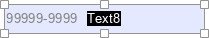
Creating a new Zip Code field
Zip Code field is used to enter a zip code corresponding to an arbitrary mask given by the form creator. It is set to 99999-9999 by default.
To insert a zip code field,
- place the insertion point within a line of the text where you want the field to be added,
- switch to the Forms tab of the top toolbar,
-
click the
 Zip Code icon.
The form field will appear as a graphic object in the middle of the page. The Form settings menu will open to the right.
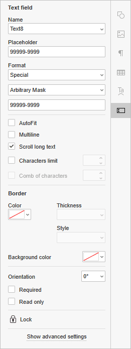
- Name: enter the name of the field that will serve as a group designation.
- Placeholder: type in the text to be displayed in the inserted zip code form field.
- Format: choose the content format of the zip code field, i.e., only the chosen character format will be allowed: None, Number, Percentage, Date, Time, Special, Regular Expression (the text shall correspond with the custom expression).
When you choose a Date, Time, Special or Regular Expression format, an additional field below the Format field appears.
- AutoFit: check the box to automatically fit the font size to the field size.
- Multiline: check the box to create a form field with multiple lines, otherwise, the text will occupy a single line.
- Scroll long text: this setting is enabled by default.
- Characters limit: no limits by default; check this box to set the maximum characters number in the field to the right.
- Comb of characters: disable the Scroll long text option to unlock the comb of characters. It will spread the text evenly within the inserted zip code field and configure its general appearance. Leave the box unchecked to preserve the default settings.
- Border color: click the icon to set the color for the borders of the inserted zip code field. Choose the preferred border color from the palette. You can add a new custom color if necessary. When you pick a color, the following options will become available:
- Thickness - choose whether you want the borders to be thin, medium or thick.
- Style - adjust the style of the borders: Solid, Dashed, Underline, Beveled or Inset.
- Background color: click the icon to apply a background color to the inserted zip code field. Choose the preferred color out of the standard colors, or add a new custom color if necessary.
- Orientation: choose one of the available presets to set the orientation of the text.
- Required: check this box to make the zip code field a necessary one to fill in.
- Read only: check this box to prohibit editing the zip code field.
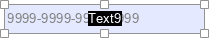
Creating a new Credit Card field
Credit Card field is used to enter a credit card number corresponding to an arbitrary mask given by the form creator. It is set to 9999-9999-9999-9999 by default.
To insert a credit card field,
- place the insertion point within a line of the text where you want the field to be added,
- switch to the Forms tab of the top toolbar,
-
click the
 Credit Card icon.
The form field will appear as a graphic object in the middle of the page. The Form settings menu will open to the right.
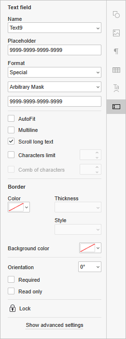
- Name: enter the name of the field that will serve as a group designation.
- Placeholder: type in the text to be displayed in the inserted credit card form field.
- Format: choose the content format of the credit card field, i.e., only the chosen character format will be allowed: None, Number, Percentage, Date, Time, Special, Regular Expression (the text shall correspond with the custom expression).
When you choose a Date, Time, Special or Regular Expression format, an additional field below the Format field appears.
- AutoFit: check the box to automatically fit the font size to the field size.
- Multiline: check the box to create a form field with multiple lines, otherwise, the text will occupy a single line.
- Scroll long text: this setting is enabled by default.
- Characters limit: no limits by default; check this box to set the maximum characters number in the field to the right.
- Comb of characters: disable the Scroll long text option to unlock the comb of characters. It will spread the text evenly within the inserted credit card field and configure its general appearance. Leave the box unchecked to preserve the default settings.
- Border color: click the icon to set the color for the borders of the inserted credit card field. Choose the preferred border color from the palette. You can add a new custom color if necessary. When you pick a color, the following options will become available:
- Thickness - choose whether you want the borders to be thin, medium or thick.
- Style - adjust the style of the borders: Solid, Dashed, Underline, Beveled or Inset.
- Background color: click the icon to apply a background color to the inserted credit card field. Choose the preferred color out of the standard colors, or add a new custom color if necessary.
- Orientation: choose one of the available presets to set the orientation of the text.
- Required: check this box to make the credit card field a necessary one to fill in.
- Read only: check this box to prohibit editing the credit card field.
Moving form fields
Form fields can be moved to another place in the document: click the field and drag it without releasing the mouse button to another position in the text as you would a graphic object.
Creating required fields
To make a field obligatory, check the Required option. The mandatory fields will be highlighted with purple.
Locking form fields
To prevent further editing of the inserted form field, click the  Lock icon. Filling the fields remains available.
Removing form fields
To remove a form field and all its contents, press the Delete key on the keyboard.