Autoformen einfügen
Eine Autoform einfügen
- wählen Sie das Arbeitsblatt aus, auf dem Sie die Form platzieren möchten,
- tippen Sie auf das
 Symbol in der oberen Symbolleiste, um das neue Objekt-Einfügepanel zu öffnen,
 - wechseln Sie zum
 Form-Tab,
 - wählen Sie eine der verfügbaren Autoformen aus.
Die ausgewählte Autoform wird hinzugefügt. Nun können Sie deren Eigenschaften und Position ändern.
Formeinstellungen anpassen
- wählen Sie die Form aus, indem Sie auf deren Rand tippen (das rechteckige Feld um die Form sollte als durchgezogene Linie angezeigt werden),
- öffnen Sie das Form-Einstellungsfenster, indem Sie
- auf das
 Symbol in der oberen oder unteren Symbolleiste tippen, oder
 - die Option im Pop-up-Menü antippen,
- auf das
- tippen Sie auf das notwendige Menüelement: Stil, Form ändern, Anordnen oder Erweiterte Einstellungen. Verwenden Sie das
 Symbol links, um zum vorherigen Einstellungsabschnitt zurückzukehren.
Der Stil-Abschnitt enthält die folgenden drei Registerkarten:
- Füllung - um den Innenraum der Autoform mit einer Vollfarbe, einem Verlauf, einem Bild oder einem Muster zu füllen.
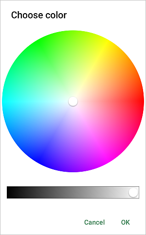
- Auf der Farbe-Registerkarte nach oben wischen, um alle Paletten zu sehen, und die notwendige Farbe auf der Themenfarben- oder Standardfarben-Palette antippen oder eine eigene Benutzerdefinierte Farbe erstellen. Wenn Sie keine Füllung verwenden möchten, tippen Sie auf die
 Ohne Füllung-Option.

Um eine neue Benutzerdefinierte Farbe hinzuzufügen, folgen Sie diesen Schritten:
- tippen Sie auf das
 Symbol im Abschnitt Benutzerdefinierte Farben.
 - verwenden Sie die Farbpalette, wählen Sie die notwendige Farbe und bestimmen Sie deren Farbton,
- tippen Sie auf die OK-Taste, um die Farbe anzuwenden.
Die hinzugefügte Farbe wird auch im Abschnitt Benutzerdefinierte Farben platziert, wo sich die zuletzt verwendeten benutzerdefinierten Farben befinden.
- tippen Sie auf das
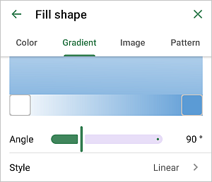
- Verlauf - wählen Sie zwei Farben für einen sanften Farbverlauf, stellen Sie den Winkel über den Schieberegler ein und wählen Sie einen der verfügbaren Übergangsstile: Linear oder Radial.
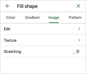
- Bild - wählen Sie das Bild, das in die Form eingefügt werden soll.
- Tippen Sie auf die Bearbeiten-Option und wählen Sie ein Foto aus Ihrer Bibliothek, fügen Sie ein Bild per URL hinzu, machen Sie ein Foto, fügen Sie ein Bild aus Dateien ein oder löschen Sie ein Bild.
- Tippen Sie auf die Textur-Option und wählen Sie eine der verfügbaren Texturen.
- Aktivieren oder deaktivieren Sie die Streckung-Option, um das Bild/die Textur vollständig in die Form einzufügen oder die Originalgröße des Bildes/der Textur beizubehalten.
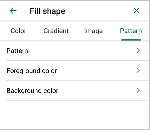
- Muster - wählen Sie ein Muster, um die Form zu füllen.
- Muster - tippen Sie auf diese Option und wählen Sie eines der verfügbaren Muster.
- Vordergrundfarbe - wählen Sie eine der verfügbaren Themen- oder Standard-Farben oder setzen Sie Ihre Benutzerdefinierte Farbe für den Muster-Vordergrund.
- Hintergrundfarbe - wählen Sie eine der verfügbaren Themen- oder Standard-Farben oder setzen Sie Ihre Benutzerdefinierte Farbe für den Muster-Hintergrund.
- Auf der Farbe-Registerkarte nach oben wischen, um alle Paletten zu sehen, und die notwendige Farbe auf der Themenfarben- oder Standardfarben-Palette antippen oder eine eigene Benutzerdefinierte Farbe erstellen. Wenn Sie keine Füllung verwenden möchten, tippen Sie auf die
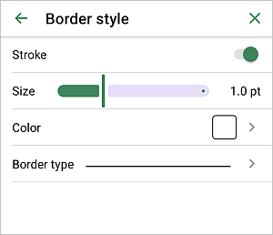
- Rahmenstil - den Rahmen festlegen:
- Strich - den Schalter umlegen, um die Rahmenanzeige zu aktivieren oder zu deaktivieren.
- Größe - die Rahmengröße durch Ziehen des Schiebereglers einstellen.
- Farbe - die Rahmenfarbe auf der Palette auswählen.
- Rahmentyp - einen der verfügbaren Rahmentypen auswählen.
Verwenden Sie das
 Schnellzugriffssymbol in der unteren Symbolleiste, um schnell auf die Formtyp-Einstellungen zuzugreifen.
 - Effekte - um den Deckkraft-Wert durch Ziehen des Schiebereglers festzulegen. Der Standardwert ist 100%. Er entspricht der vollen Deckkraft. Der 0%-Wert entspricht der vollen Transparenz. Sie können auch den Schatten-Schalter verwenden, um den Schatten zu aktivieren.
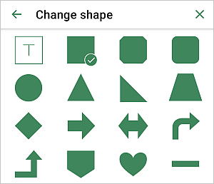
Der Form ändern-Abschnitt ermöglicht es Ihnen, die aktuelle Autoform durch eine andere aus dem Menü auszutauschen.
Verwenden Sie das
 Schnellzugriffssymbol in der unteren Symbolleiste, um schnell auf die Form ändern-Einstellungen zuzugreifen.
Der Anordnen-Abschnitt ermöglicht es, die Position der ausgewählten Autoform im Verhältnis zu anderen Objekten festzulegen, wenn mehrere Objekte sich überlappen. Weitere Informationen finden Sie im Abschnitt Objekte manipulieren dieses Leitfadens.
Der Erweiterte Einstellungen-Abschnitt ermöglicht es Ihnen, die folgenden Optionen zu aktivieren:
- Größe - die Größe der Autoform festlegen:
- Breite und Höhe - die Abmessungen der Autoform in einer bestimmten Maßeinheit definieren.
- Seitenverhältnis sperren - den Schalter umlegen, um das ursprüngliche Seitenverhältnis der Autoform beizubehalten.
- Maßeinheiten - eine der verfügbaren Optionen auswählen: cm, pt, Zoll.
- Füllung - um den Innenraum der Autoform mit einer Vollfarbe, einem Verlauf, einem Bild oder einem Muster zu füllen.
- schließen Sie das Formeinstellungsfenster, indem Sie auf das
 Kreuz rechts tippen.
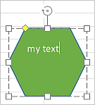
Text innerhalb der Autoform hinzufügen
- setzen Sie den Einfügepunkt, indem Sie innerhalb der Autoform tippen (das rechteckige Feld um die Form sollte als gestrichelte Linie angezeigt werden),
- beginnen Sie, Ihren Text mit der Bildschirmtastatur einzugeben.
Der auf diese Weise hinzugefügte Text wird Teil der Autoform (wenn Sie die Form verschieben oder drehen, bewegt oder dreht sich der Text mit ihr).
Um den hinzugefügten Text innerhalb der Autoform zu bearbeiten,
- wählen Sie den Text aus: Doppeltippen Sie auf ein Textstück innerhalb der Form und ziehen Sie die Auswahlgriffe,
- öffnen Sie das Form-/Text-Einstellungsfenster, indem Sie
- auf das
Symbol in der oberen oder unteren Symbolleiste tippen, oder
- die Option im Pop-up-Menü antippen,
- auf das
- zum Text-Tab wechseln,
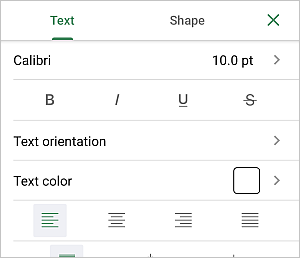
- die notwendigen Textparameter anpassen:
- Tippen Sie auf den links angezeigten Schriftartnamen (z.B. Calibri) und wählen Sie eine andere Schriftart aus der Liste der verfügbaren aus.
- Tippen Sie auf die rechts angezeigte Schriftgröße (z.B. 11 pt) und verwenden Sie die
 oder
oder
 Pfeile, um den aktuellen Wert zu verringern oder zu erhöhen.
 - Um die Schriftart Schriftstil zu ändern, wählen Sie eine der folgenden Optionen:
-
 Fett - tippen Sie auf dieses Symbol, um die Schrift fett zu machen und ihr mehr Gewicht zu verleihen.
  Kursiv - tippen Sie auf dieses Symbol, um die Schrift kursiv zu machen und ihr eine leichte Neigung nach rechts zu geben.
 Unterstrichen - tippen Sie auf dieses Symbol, um den Text mit einer Linie unter den Buchstaben zu unterstreichen.
 Durchgestrichen - tippen Sie auf dieses Symbol, um den Text mit einer Linie durch die Buchstaben zu durchstreichen.
-
- Textausrichtung - wird verwendet, um die Richtung des Textes in einer Form zu ändern. Wählen Sie die Option, die am besten zum Text passt:
 Horizontaler Text ist standardmäßig angewendet,
 Text nach oben drehen orientiert den Text so, dass die Oberseite jedes Zeichens nach links zeigt,
 Text nach unten drehen orientiert den Text so, dass die Oberseite jedes Zeichens nach rechts zeigt.
- Textfarbe - wird verwendet, um die Farbe der Zeichen im Text zu ändern. Tippen Sie auf diese Option, um das Farbpalettenfenster zu öffnen (nach oben wischen, um mehr Farben zu sehen). Wählen Sie die notwendige Farbe auf der Themenfarben- oder Standardfarben-Palette oder erstellen Sie Ihre eigene Benutzerdefinierte Farbe.
- Wenden Sie den notwendigen horizontalen Ausrichtungstyp an:
tippen Sie auf das
 Symbol,
um den Text an der linken Seite des Textfeldes auszurichten (die rechte Seite bleibt unausgerichtet).
Symbol,
um den Text an der linken Seite des Textfeldes auszurichten (die rechte Seite bleibt unausgerichtet).tippen Sie auf das
 Symbol,
um den Text in der Mitte des Textfeldes auszurichten (die rechte und linke Seite bleiben unausgerichtet).
Symbol,
um den Text in der Mitte des Textfeldes auszurichten (die rechte und linke Seite bleiben unausgerichtet).tippen Sie auf das
 Symbol,
um den Text an der rechten Seite des Textfeldes auszurichten (die linke Seite bleibt unausgerichtet).
Symbol,
um den Text an der rechten Seite des Textfeldes auszurichten (die linke Seite bleibt unausgerichtet).tippen Sie auf das
 Symbol,
um den Text sowohl an der linken als auch an der rechten Seite des Textfeldes auszurichten (zusätzlicher Abstand wird dort hinzugefügt, wo es notwendig ist, um die Ausrichtung zu halten).
Symbol,
um den Text sowohl an der linken als auch an der rechten Seite des Textfeldes auszurichten (zusätzlicher Abstand wird dort hinzugefügt, wo es notwendig ist, um die Ausrichtung zu halten). - Nach oben wischen, um die vertikalen Ausrichtungsparameter zu sehen und einen der Ausrichtungstypen anzuwenden:
tippen Sie auf das
 Symbol, um Ihren Text oben im Textfeld auszurichten;
tippen Sie auf das
 Symbol, um Ihren Text in der Mitte des Textfeldes auszurichten;
tippen Sie auf das
 Symbol, um Ihren Text unten im Textfeld auszurichten.
- schließen Sie das Form-/Text-Einstellungsfenster, indem Sie auf das Kreuz rechts tippen.
Die Form entfernen
Wählen Sie die Form aus, indem Sie darauf tippen, und fahren Sie auf eine der folgenden Weisen fort:
- tippen Sie auf die
 Option im Pop-up-Menü, oder
 - öffnen Sie das Formeinstellungsfenster, indem Sie auf das
Symbol in der oberen oder unteren Symbolleiste tippen, nach oben wischen und die Form entfernen-Taste antippen.